Formatting Spectra

3. Formatting Spectra
Patrick Hendra & Anne de Paepe
University of Southampton
Southampton
SO17 1BJ
UK
Email:ijvs [at] soton.ac.uk
Those of us who are too old to admit their age were bought up using continuous charts in our spectroscopy. Almost all the early infrared (or Raman) instruments output the data to commercial recorders made by such manufacturers as Honeywell Brown. These enormous devices generated a continuous ruled chart running over a horizontal roller. An ink pen (which clogged at the interesting moment) ran on a horizontal rail and hence a line (usually red) appeared on a long piece of chart paper. Some manufacturers built their own recorders into the instrument e.g. Grubb Parsons, but in the early days, the Honeywell Brown was king. Depending on scan speed and paper feed rate the wavelength or wavenumber scale varied but if a lab adopted a “house” set of conditions, the spectra were all roughly the same length. Of course, inter instrument comparisons were almost impossible. Clearly, the charts contained no grid to indicate wavelength or wavenumber, so we relied on the manufacturer generating a pulse (say every 50cm-1), we interpolated from these ‘blips’ and scribbled values on the chart.
By the 1960’s some order was taking over – an increasing number of manufacturers produced printed charts. Beckman and Perkin Elmer were using this solution as early as the late 1950’s. Now the spectra appeared against a pair of scales and were directly comparable. Very rapidly, all the manufacturers fell into line and the quality of data presentation rapidly improved so that the charts could be filed, retrieved and compared at will. Some manufacturers divided the spectrum to keep the chart sizes handy, but in general all was logical and reasonable†.
† Some manufacturers rolled the chart round a drum e.g. Perkin Elmer in the 21, 25 and 37 series instruments. Gradually, flat bed recorders became popular e.g. Beckman DK2 Visible – near infrared instrument, Unicam and Hilger Infrascan mid infrared instruments.
Don’t run away with the idea that once the pre-printed chart became available the use of the chart recorder was doomed. As late as the late 60’s, chart recorder instruments were being produced, but the manufacturers overwhelmingly adopted the neater more compact and convenient pre-printed charts. Raman producers hung on longer using strip chart recorders well into the 70’s.
To give you some examples, we dug out some ancient spectra. Figure 1 is the Raman spectrum of solid K2CrO4. As you will see the frequencies are indicated by blips.
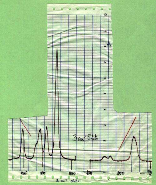
Figure 1. The Raman spectra of K2CrO4 crystals. The continuous chart in this case is about 10 inches in width and ran over a sprocketed drum – thus the holes down the edges.
Note that blips are superimposed on the spectra to indicate the cm-1 values. Infrared instruments of the 1950’s and 60’s used this type of display.
In Figure 2, we show an example of a spectrum recorded on a pre-printed chart. The spectrum is of Polystyrene and was recorded on a model 237 Perkin Elmer.
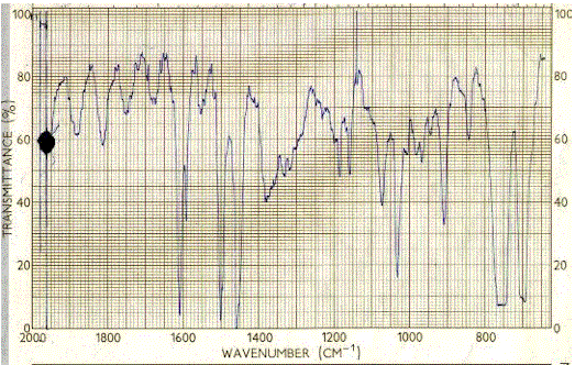
Figure 2. Infrared Spectrum of polystyrene film. The Perkin Elmer Model 237 Infrared had a removable vertical drum. The paper was wrapped around the drum and held with a spring clip. 2 sheets covered the mid infrared range so spectra were recorded in two chunks. The example is of the low frequency half.
Note the ink-blob – pens tended to block up or leak – or both!
These days, we always present spectra as absorbance or transmission vs wavenumber, but this was not always the case. Until the 60’s, many infrared spectra were recorded as transmission vs wavelength. In the States, this presentation lasted longer than it did in Europe. Comparison between these infrared spectra and their Raman compliments was, of course, quite impossible and comparing a linear wavenumber spectrum with a linear cm-1 one was a real teaser.
In Figure 3, we show an example of a wavelength spectrum. Note that the 3000 cm-1 region is horribly compressed whilst the low frequency range is spread out. Remember 3000 cm-1 is 3.33µ but 750 cm-1 approximates to 13µ.
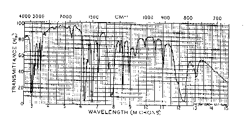
Figure 2. Infrared Spectrum of polystyrene film. The Perkin Elmer Model 237 Infrared had a removable vertical drum. The paper was wrapped around the drum and held with a spring clip. 2 sheets covered the mid infrared range so spectra were recorded in two chunks. The example is of the low frequency half.
Note the ink-blob – pens tended to block up or leak – or both!
Early FTIRs output their data to printers and the format was consistent e.g. the Nicolet MX-1 and the Perkin Elmer PP1 printer. Both systems produced long charts with sensible displays and the absisca was logical and predictable. As a result, if a ‘house’ presentation was adopted spectra were easily comparable. Then came the PC and logic went out of the window – spectra were presented on A4 (or US standard) sheets and both the x and y scales could be to any scale the user intended or just finished up with. The net result is that you cannot visually compare spectra. You all know to your cost what we mean, but in Figure 4 we illustrate the point; the spectra are presented in just sufficiently different ways to make visual comparison a nightmare.
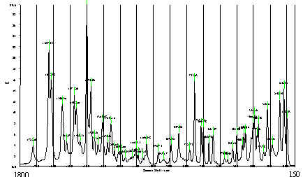
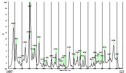
Figure 4. Raman spectra of two compounds (Norfloxacine and it’s hydrate) presented on two slightly different axes. The wavenumber scales are 1800 -150 cm-1, the bottom 1687 -123 cm-1. Visual comparison which would be essential in hydration studies on Norfloxacine are really difficult.
Does it matter when the data is on the hard disk? Yes! When we talk to our colleagues, weI need diagrams – not all the spectra we have ever recorded, but only the really useful ones. We need with colleagues to compare spectra so the presentation must be comparable. Dozens of spectra on slightly different axes are a menace. Some tell us the answer is to use the computer, but this is no solution. It is worth setting up a formal presentation on the computer, but the cost in time of collecting the potentially valuable data on the computer is too time consuming for informal frequent meetings and discussions. Further, presentation of data on the computer can be very hard to read unless projection is used. No – paper is still invaluable so the presentation should be comparable spectrum to spectrum and instrument to instrument including i.r. to Raman.
Some years ago Jon Agbenyega and I generated a short series of Raman spectra of polymers and it was published by John Wiley. The publishers wanted the output on paper so we gave considerable thought to the method of presentation. The infrared or Raman data should be logical, easy to read and consistent. The format is given below.
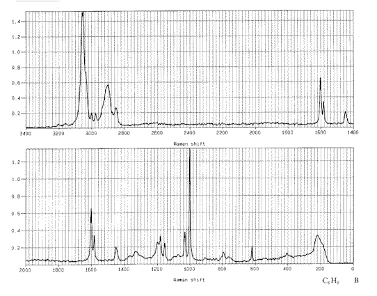
Figure 5. A page taken from Agbenyega and Hendra. The Raman Spectra of Polymers, J.Wiley Chichester 1993.
Infrared spectra can be presented on exactly the same axes.
You will see that the spectrum is divided so that it fits easily on an A4 (or American equivalent) page. The use of a grid spaced at a logical pitch in mm’s (10cm-1 per mm)means that if no frequencies are indicated you can use your eye to estimate the cm-1 value and/or confirm it with a ruler.
My proposal is that we the users of spectrometers – no less than 1000 of us debate what format is ideal and then we try very hard to get it adopted Internationally as a standard display.
Back when pre-printed charts were used, those who wanted to present high resolution data or only wanted to consider a small part of the spectrum broke with standard format. I see no reason why this could not be the case in my proposal.
So please answer the following questions and e-mail your replies to the Editorial Office.
1. Do you agree that a “standard” presentation format would be valuable both in-house and in comparing printed data between labs?
2. Do you like the format proposed in Figure 5? If you have your doubts, please tell us more. If you don’t like our suggestions please send an alternative.
3. Where infrared and Raman spectra are to be overprinted together on the same diagram, is it appropriate to use two differently coloured lines? Hence –
4. Do you use a colour printer? Are colour printer facilities widely available in your organisation?
5. Do you prefer having the band cm-1 values printed directly onto the chart or do you prefer a table (remembering how easy it is to estimate the wavenumber value within the format we suggest)?